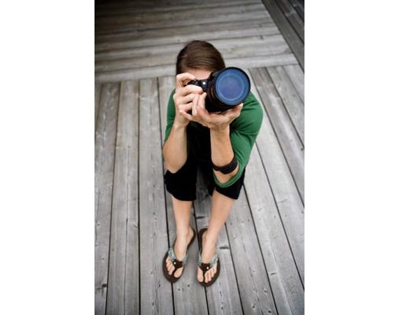
Composition is one of the most important features of a good photograph. A well-composed photograph is symmetrical, proportionate and well lit; in this sense, composition in photography is similar to "mis en scene" in film. However, composition standards are very high in photography, because photography is an exclusively visual medium. Guidelines for composition are naturally somewhat subjective; however, most photographers agree on a few basic ones. These guidelines are not rules and are not followed by all photographers.
Patterning
Often, good photographs display some kind of visual pattern. For example, a picture of a cubicle farm can transcend boring office photography and become artistic if the cubicles are arranged in an interesting pattern. There are many different types of patterns. Block patterns are made out of connected or overlapping squares and rectangles. Dot patterns are made up of connected dots. More-intricate geometrical patterns can be made out of all kinds of connected objects, from octagons to intricately arranged TV sets.
Balance
Good photographs always have some kind of balance: opposing and complementing colors, symmetrical shapes or a combination of both. Symmetry is the easiest way to achieve balance in a photograph. If you stand in the middle of a railroad with nothing but grass on both sides of it and take a shot, you will have very symmetrical picture. Of course, such a picture would also be fairly boring. A mix of symmetrical shapes with opposing colors can make a picture interesting.
Texturing
All photographs, good and bad, feature some kind of texture. Many photos feature more than one texture: for example, a picture showing grass, sand and water has three textures in it. It is good to feature multiple, complementary textures in a photograph. For example, the contrast of grass against still water is popular among nature photographers, because it has a strong, jagged versus flat contrast.
Field Depth
A photograph's depth of field is how far away the focal point is from the viewer's point of view. If you are photographing nature shots, aim for a deep depth of field, so that the viewer can see the majestic scenery surrounding the animal or plant in the focal point. If you are taking portrait shots, you should aim for a shallow depth of field, to emphasize the details of the person's facial features. Move the camera's lenses in and out to change the focal point.
Lines
Many photographs, but not all photographs, make heavy use of lines. Lines are extremely valuable in photographs because they indicate distance and dept. If you put your camera up against a handrail and take a picture, the viewer will get a sense of the handrail's length by how much narrower it is at the point where it disappears. You can also use lines to emphasize symmetry and color. For example, if one half of an object is blue and the other half is red, a black line down the middle will draw attention to the symmetry and color contrast.
Proposal: Guidelines and Samples
sampleproposal.netResearch proposal is a written document which provides detailed information about the proposed program. It is addressed a particular topic or issue like academic or ...
Techniques for Web Content Accessibility Guidelines 1.0
www.w3.org/TR/WAI-WEBCONTENT-TECHS1 How this Document is Organized. Section 2 of this document reproduces the guidelines and checkpoints of the "Web Content Accessibility Guidelines 1.0" .
National Guideline Clearinghouse Home
guidelines.govNGC is the National Guideline Clearinghouse. ... New/Updated Guideline Summaries. ADI, ACCF, ACG, AGAI, CDWC, HRS, USPSTF ; View All
APA - Welcome to the Purdue University Online Writing Lab (OWL)
owl.english.purdue.edu OWL Research and Citation APA StyleAPA Sample Paper APA Style Research and Citation Electronic SourcesAPA (American Psychological Association) style is most commonly used to cite sources within the social sciences. This resource, revised according to the 6th edition ...
APA Style
apastyle.orgThe Basics of APA Style Learning APA Style APA Style Help View NowOfficial American Psychological Association site includes frequently asked questions, guidelines for electronic media citations and spelling and ordering information.
Home Institute for Writing and Rhetoric
dartmouth.edu/writing-speechRWIT. RWIT is a free service dedicated to helping members of the Dartmouth community develop more effective strategies for generating and organizing their ideas ...
Design of Scientific Posters - Writing Guidelines for Engineering ...
www.writing.engr.psu.edu/posters.htmlDiscussion of reports in the Writing Guidelines for Engineering and Science Students: guidelines to help students of science and engineering make their writing more ...
Purdue Online Writing Lab
owl.english.purdue.edu/owlThe Online Writing Lab (OWL) at Purdue University houses writing resources and instructional material, and we provide these as a free service of the Writing Lab at ...
HTML Techniques for Web Content Accessibility Guidelines 1.0
www.w3.org/TR/WCAG10-HTML-TECHSAbstract. This document describes techniques for authoring accessible Hypertext Markup Language (HTML) content (refer to HTML 4.01 ). This document is intended to ...
Photography Composition Tips - YouTube
www.youtube.com/watch?v=GgB0VEWDCRkSome guidelines to apply to your photographs when shooting landscapes.
0 comments:
Post a Comment